

Wells Fargo
Stagecoach illustration
Agency:
SIEGEL+GALE
BACKGROUND:
Wells Fargo is a financial services company based in San Francisco, California. Founded in 1852, it is one of the largest banks in the United States, offering a wide range of services such as banking, lending, insurance, and investment management. The company operates through a network of branches and ATMs across the country and has a strong online and mobile banking presence. Wells Fargo is known for its stagecoach logo and its iconic red and gold color scheme. In recent years, the company has faced a number of scandals and controversies related to its business practices and culture.
ROLE:
To communicate its transformation after significant changes in leadership, business models, and customer engagement, Wells Fargo sought the help of Siegel+Gale to develop a comprehensive brand identity. The new identity symbolizes rebirth and a renewed focus on customers, employees, and the American public. As part of my work on various projects with Wells Fargo, I contributed to the recent rebrand and modernization of the stagecoach illustration. The work here is the initial phase of design that I was responsible for. The task was to redesign the stagecoach to adapt to different visual contexts, primarily digital and mobile.

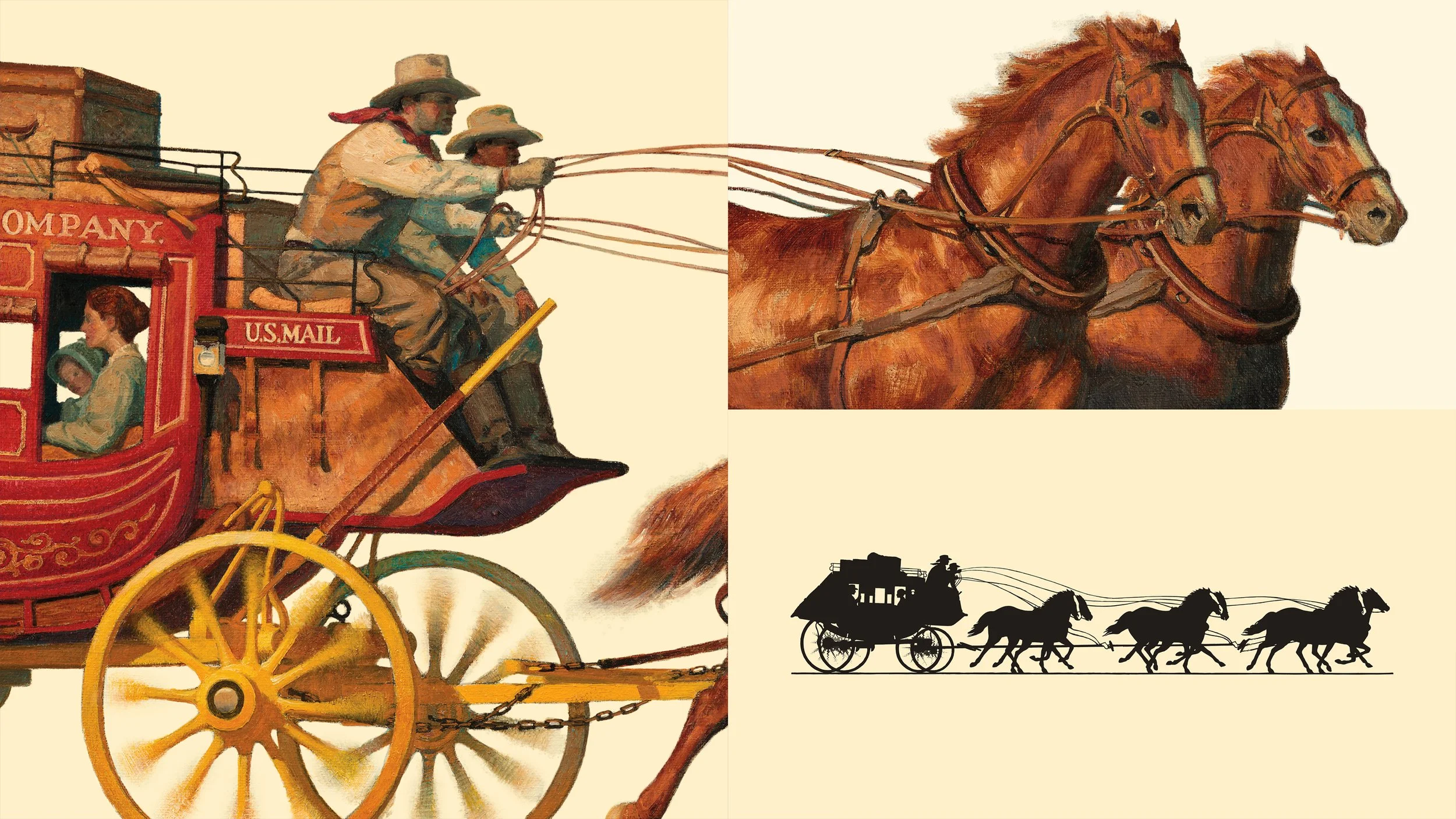
Original stagecoach artwork by John Rush


INITIAL PHASE OF EXPLORATION


FINAL PHASE OF EXPLORATION


